The Catastrophe Colours 2018 – An Exhibition by Gonzalez Haase AAS and June 14 Meyer-Grohbrügge & Chermayeff


Colours are everywhere, they are so present that they become invisible. They are taken from nature, in the materials that were used to make them, in the names that they still carry, and they are given back to nature, in the form of civilization, as a form of domination. Colours are contradictory in the sense that they mean everything and mean nothing at the same time. To paraphrase Gertrude Stein: Red is red is red. To see colours is to see the world. To understand colours is to understand the world. There is an akward imbalance between ignorance and information, innocence and sensibility.
A few attempts have been made to categorize colours in order to form an aesthetic set that organizes the access to the world. Goethe, Gropius, Le Corbusier, among others, tried to show how the perception of reality and the creation of reality might be connected in this inherently modern process. They were somewhat romantic in their notion that a disorderly world might yield to a system of order. This is the modernist conceit. It is also the modernist limitation.
What we see now, looking back at the modern period as our own antiquity, is a reductive model of reality, based on the mechanics of Newton, which corresponds to a simplistic sensibility when it comes to deciphering the world. What we need in the age of quantum mechanics is a more dynamic model that is able to incorporate contradictory realities and appearances. If modernity was all about demystifying the world – entzaubern is the German word for this -, the task now is not to re-mystify the world, this is reactionary politics in aesthetics as in practise; the task is instead to complicate reality, to mess with reality, to untangle and re-entangle reality and show it as the unruly web of informations that it is.
Catastrophe Colours is in that sense a project that owes as much to the old as to the new. It is both a return to the premodern way of extracting colours from the world we live in and a reversal of the mindnumbing colouring of the world we think we live in. It is a questioning of our relation to the world and our ability to ignore or understand it. It is challenging the consumption, of colours, of reality, of the world, and it points to the tragedy that man‘s conquest always was and always will be. It does not peddle morality. But it is both heartfelt and humane. It is a political as much as an aesthetic project at the turn of the Anthropocene.
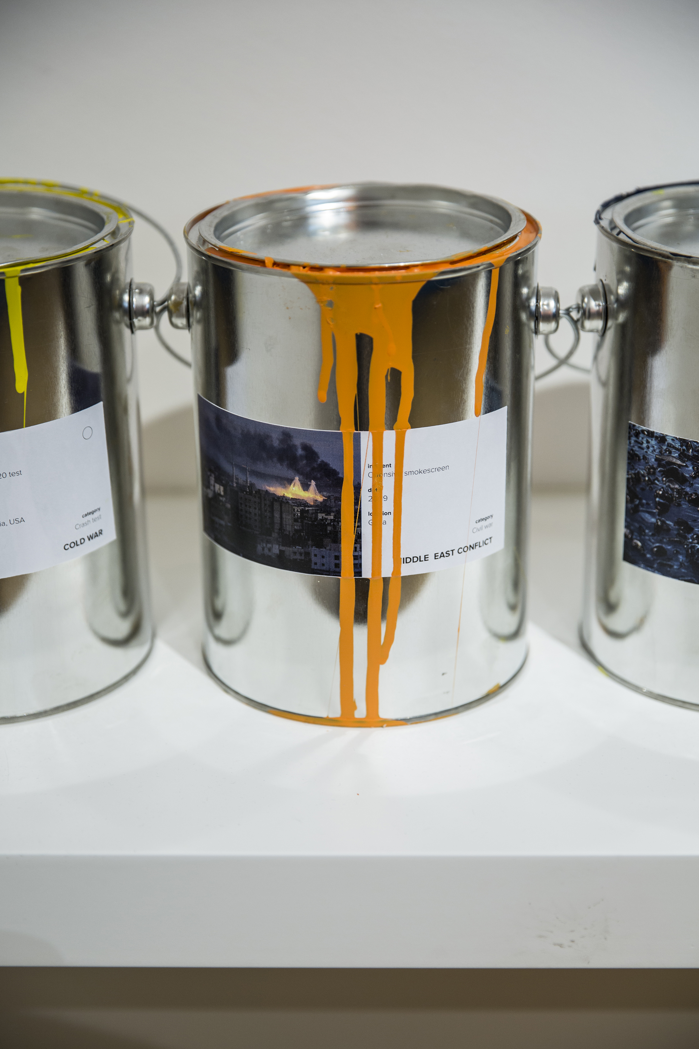
The catastrophes in question are all man-made. They are industrial, like oil spills, atomic accidents, large scale killings of animals; they are natural in the sense that they show how human kind has messed with the order of things, like floods and storms and other disasters that can be traced to our rape of the world; they are criminal, like the wars that are fought in the name of power or the people, of interests both overt and clandestine. They are all toxic, one way or another, and the beauty that these colours show is only partly countered by the dark knowledge they are informed with.
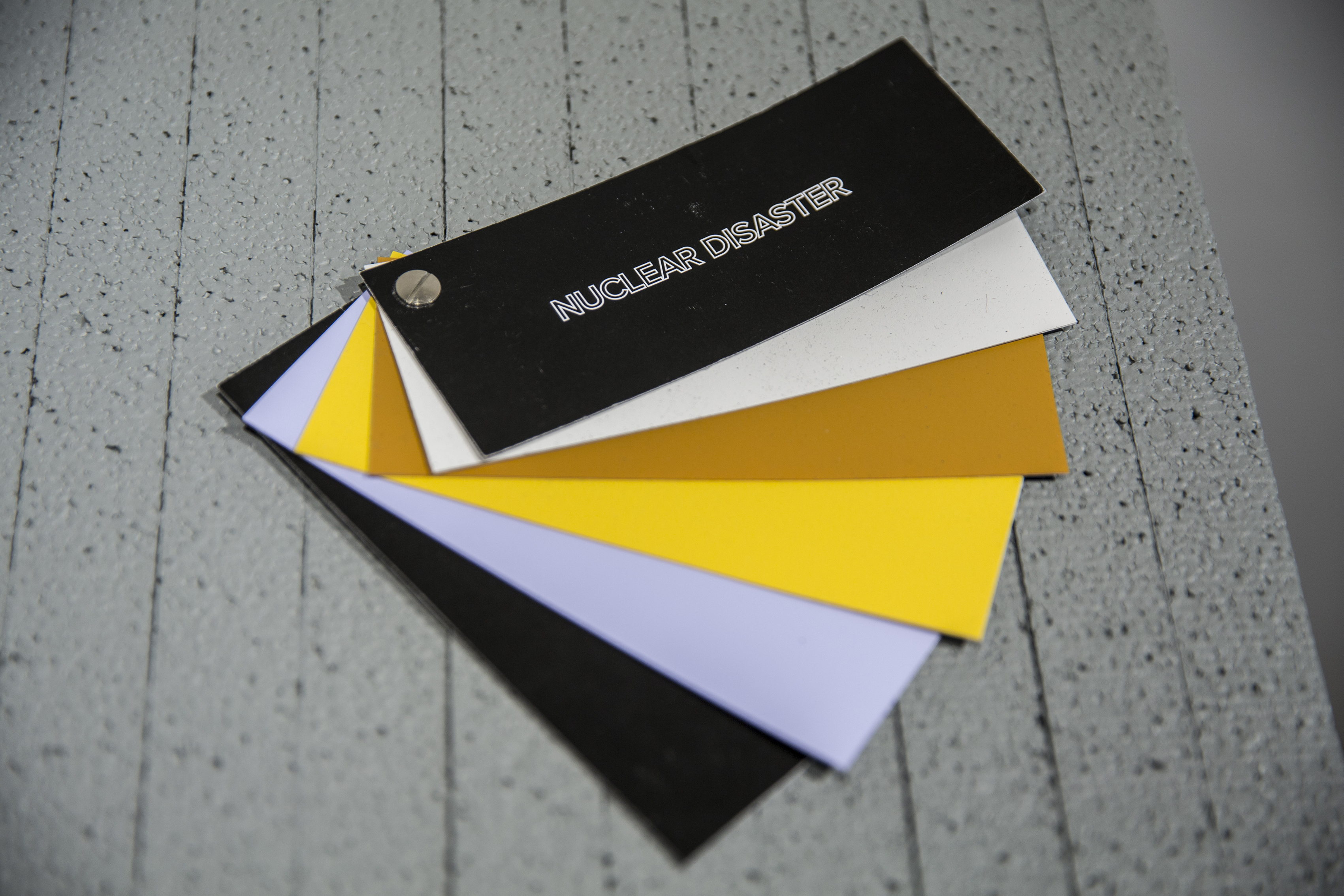
This dark blue isn‘t merely pretty, the promise of a sheltering sky, it relates on the contrary to the story of a sky that comes raining down on us, it is the colour of the crash of the space shuttle Challenger in 1986. Or that light blue isn‘t actually a colour of boyish longing and innocence, it extracted from a photo of the nuclear disaster in Fukushima in 2011. This purple is napalm, this yellow is a flamethrower used in the Vietnam War, this pink is napalm again, this darker grey is the destruction of Arbeen in Syria, this lighter grey is the shelling of Ariha, again in Syria: Disaster, we see, is our real nature, and if there is beauty, it is toxic beauty.
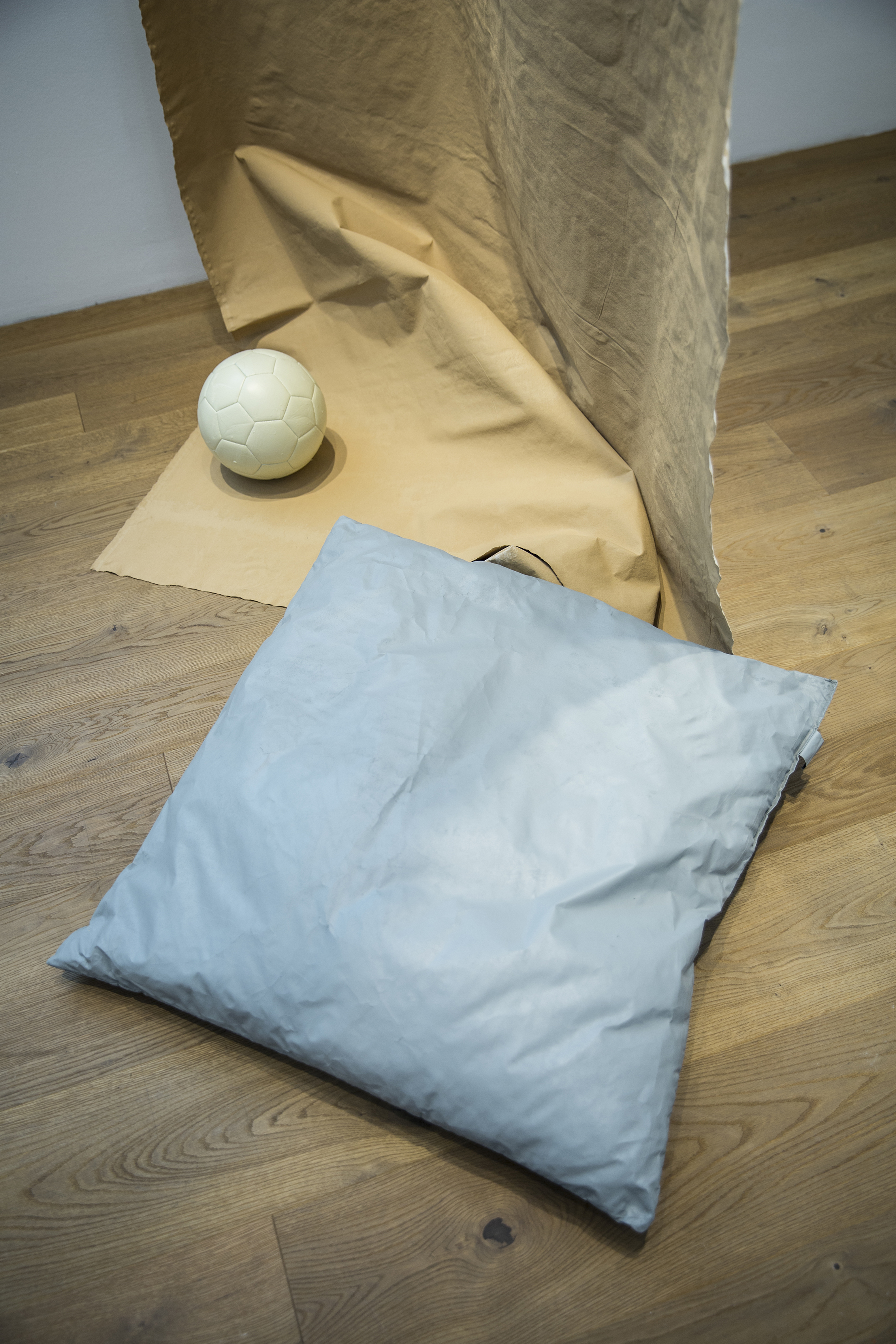
What AAS and June14 propose in this project is the mediatization of colours in a world overwhelmed by media. They use colours to tell the story of our time, as an access to our image-informed subconscious, to complicate the relationship between the interior (an object, the domestic, the private) and the exterior (a catastrophe, history, the political). They organize these colours and find patterns and correspondence in these families of colours that refer to specific events or categories like Vietnam War or Middle East. The colours in these categories relate to each other, they reference each other, they inform each other. This again is the consequence of a certain aesthetic of the time, as created in the media that is used and the images that are chosen.
The colours of the Vietnam War seem like Pop explosions dating from a Pop era, because these are the images available, because this is the way the story of this war has been told, out in the open, fostering protest at home, mediated in an age where the information society began to take hold. The colours of the Syrian War by contrast are muted, like the discourse about this abominable war, specifically abominable through the ineptitude and unwillingness of the West to find an answer, to stop the war. The colours available reflect the state of media, society, politics, it is the aesthetic offered by the specific forms of photography, television and digital media.
We are the perpetrators, this is the story behind those colours; we live with what we did and keep doing, this is the urgency in Catastrophe Colours. Each colour works like a time capsule, like a mind-bomb, in the words of the art activist Kalle Lasn. What AAS and June14 start is a process in the course of which we can, if we want, come to realize how cruelty and beauty are connected; and that innocence is impossible. This sounds ominous and dire. And it is. At the same time this project reflects an attitude of morality infused playfulness: We behave like grown-up children on this playground that is the world. We see and we don’t see. But everything is there to see. It’s in the colours. Not Mountain Dew, but chemical spill. It’s the tragedy of time: We knew. These colours are memories from the future.
– Text by George Diez